MoBrix-ui - V1 guide
React components for every app, easy to use and customize
Summary
- MoBrix-ui philosophy
- Components building process
- Shared components properties
- Customizable UI
- Box components
- Getting started
- Installation
- Usage
- Tests
- Authors
- License
mobrix-ui philosophy
This library is built upon few (but important) concepts:
- Small library size, to not impact on final app bundle size
- Few dependencies, to not introduce a bunch of additional packages (that could also introduce bugs or version conflicts with pre-existent packages)
- Let the user customize every part as desired, but with default values set otherwise, to make every component ready to be used without so many parameters
- Every component should be integrable into every react app, so their behaviour must be customizable too (with callbacks, for example)
The same concepts are also the base of another project I maintain, MoBrix-engine (check it out, it is also the base of MoBrix-ui guide page !)
Components building process
This library use a standardized process to build every component. As result, every component has a shared initial logic, shared CSS styles and shared properties.
Shared components properties
Some properties are shared between all components, for a smoother dev experience. In addition, this makes every single component easily re-usable. Let's see them in details:
| Property | Description |
|---|---|
className |
custom className applied on main container |
dark |
Enable/disable dark mode |
hide |
Hide/show component |
id |
data-id parameter (for testing purpose, to easily find the component into the DOM) |
shadow |
Enable/disable shadow behind component |
style |
Css inline properties applied on main container |
unstyled |
If true, no standard mobrix-ui styles will be applied on the components (useful for example, with image buttons) |
With these shared properties is possible to drive every component behaviour and UI with an external state management system
Customizable UI
MoBrix-ui-components components UI is globally configurable, with CSS variables. By defining some specific custom CSS variables into your app css, you'll change the UI of all components:
| CSS variable | Description | Default value | Related CSS attribute |
|---|---|---|---|
--mobrix-ui-custom-background-dark |
Components background, when in dark-mode (dark is set to true). | linear-gradient(to right, #2d3748, #1d232e) |
background-image |
--mobrix-ui-custom-background-color-dark |
Components background color, when in dark-mode (dark is set to true). | #1d232e |
background-color |
--mobrix-ui-custom-text-color-dark |
Components text color, when in dark-mode (dark is set to true). | white |
text-color |
--mobrix-ui-custom-background-light |
Components background, when not in dark-mode (dark is set to false). | linear-gradient(to right, #fff, #eaebec) |
background-image |
--mobrix-ui-custom-background-color-light |
Components background color, when not in dark-mode (dark is set to false). | #f5f5f5 |
background-color |
--mobrix-ui-custom-text-color-light |
Components text color, when not in dark-mode (dark is set to false). | #1b1b1b |
text-color |
If you don't set these variables, the default values will be used.
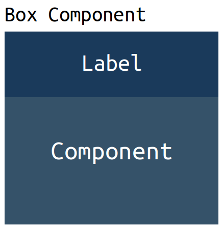
Box components
Some components are designed with a specific structure, to better control and customize their look and feel. This type of components is called Box Component, for their particular structure. In addition to the shared properties, as they are part of MoBrix-ui, they accept 3 additional (and optional) properties:
label, a string or a component rendered above the final componentvalue, a specific property that drive the component UI, its type vary depends on component itself (for example, for the CheckBox component, it is the check status, as aboolean)defaultValue, the default value to use whenvalueis not given or isundefined
Getting started
Installation
If you want to use this library inside your project, just install it:
npm i mobrix-ui
Usage
After installation, you can use every MoBrix-ui component in your app. Run this example to see them in action:
import { Card, Container, Link } from "mobrix-ui";
import { render } from "react-dom";

render(
  <Container animated>
    <Card
      dark={true}
      body={<p>This page is entirely made with MoBrix-ui components !</p>}
      footer={
        <Link to="https://cianciarusocataldo.github.io/mobrix-ui">
          MoBrix-ui page
        </Link>
      }
    />
  </Container>,
  document.getElementById("root"),
);

If you want to customize the UI globally, initialize the dedicated CSS variables:
* {
  --mobrix-ui-text-color: #f5f5f5;
  --mobrix-ui-background-color: #1b1b1b;
}
Tests
Unit tests for every component are located inside tests folder. The test script is executed with pre-defined test command:
npm run test
Authors
License
This project is licensed under the MIT License - see the LICENSE file for details